Skip navigation

PROGRESS POSTS

TALKING BENCH by Alessandra Florian&Tamara Romeo

27 February 2007 – 12:23 am

1.PROJECT NAME
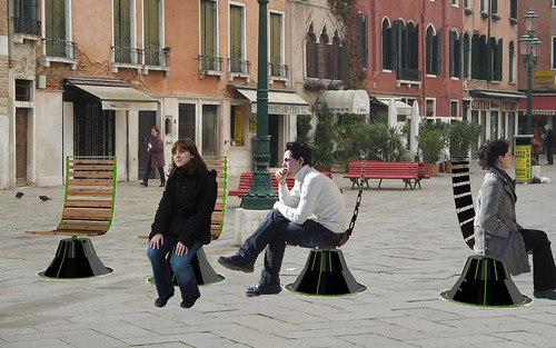
 Talking bench
Talking bench

2.AIMS
a. Who is it for?
Talking bench is an informative bench for tourists.
In many case foregners come just for few days in Venice and have problems to orient themselves and to exactly know what they are watching (maybe they passing in front of a famous building but they don’t notice it).
This bench tries to  gives useful information to orient people giving also history pills about where these people are.
b.What information does it give?
First it tells the name of the square where you are. After it starts giving information about the buildings near the bench and their history  according to what you are watching.
c. Where is it?
Campo S. Stefano in Venice. This square is a passing place for a lot of tourists and offers different kind of possible information to tell (DIRECTIONS - Rialto, S.Marco, Accademia- FAMOUS BUILDINGS- Palazzo Pisani, Loredan, Chiesa di S.Stefano,  Chiesa di S.Vidal…-).

3.EXPERIENCE
a. What happens?

The system gives audio recordings dealing with the square starting to the name of the pace, to names of buildings arriving to curiosities. It tells things according to the gaze of the viewer. In fact the bench can turns on itself and its motion allow people to see different buildings and in relation to what you are seeing the seating gives you the name and history of this particular place in that very moment you are watching it. 
When the tourist sit on the bench it recognizes the nationality of him/her from a trasponder card programmed with this information. The card is gaven to tourists at their arriving in Venice.The device can now set the audio with the right language.After it starts to tell the name of the square and take the position in witch the bench stay.According to the angle covered by the bench it chooses the audio and play it.On the floor is putted a circular carpet divided into section corresponding to the different audio areas.Between two audio areas there is a silent area where people that don’t want to listen the audio can stay.People movements on the bench can also change the volume.
When the tourist is in the middle of an audio area the volume is at maximum but it decrease moving far away the center and slowly it fades out  near the next audio area to give the feeling of the audio that is changing.
b. Emotional tone

Socialization Talking bench design

Tourists can use the bench in their relaxing moments of their travelling day.
Bench’s sounds create an atmosphere that involve people into the history of the square giving a nice and unexpected experience of the place where they are.
At least the bench can be also a place where socialize. Each person can face the others and this could be a starting point for socialization.

4.IMPLEMENTATION
a. What are system inputs and outputs?
System’s inputs are basically the pressure maden when you sit down on the bench, person movements and the information contained in the transponder card.
Audiomessages, their changing and the volume increasing and decreasing are the outputs.
There’s also a fisical feedback given by the carpet on the floor that communicates to you through a bumb the audio that changes.
b. What hardware and software are needed in real life and witch ones in the prototype?
The system includes transponder card, a potentiometer to pick up the position angle, and speakers.
The final prototype will be a real chair in 1:1 scale  with the carpet and the seating’s base, maden by us.
It will requires just the potentiometer and speakers.

5.UNRESOLVED ISSUES
One problem is the visual feedback in the bench’s carpet on the floor. Not all audio areas on the carpet take the same space because there are parts full of near buildings and with a lot of information and others empty because without relevant news.
It’s good to have a visual and fisical feedback on the floor but it causes many problems. We decide to cut off some buildings and put just few area without audio (there isn’t one for every pair of audio zones).

Another problem is related with the bench shape that we try to design but maybe could be improved by more expert industrial design students.

The system requires tags (the transponder card) to recognise languages, the diffusion of this cards between tourists maybe could represent a problem at beginning.
Talking Bench presentation

Flyercafè

26 February 2007 – 9:39 pm

fc_preview_1.jpg

Flyer Café
by Davide Cocchi and Luca De Rosso

Aims
The system projects ‘flyer’ advertisements on a bar counter and allows customers to browse them and print them. It aims to combine, in an engaging and interactive way, the unregulated liveliness which characterizes fly-posted advertisements in city streets, with the congenial habits and gestures of Italian bar life. The site is Il Muro bar in the Rialto area of Venice.

Experience
The system has two types of user: the advertiser, and the customer (the reader of the flyer).

Advertisers can compose, on their computers or mobile phones, simple postcard-like flyers. These can be transmitted, either in or near the bar premises, to the bar’s Flyer Café system by Bluetooth,. Each flyer can be given a broad category: concerts, apartments for rent, etc.

The emotional tone of this transaction is efficient simplicity.

Customers’ experience is similar to that of a normal visit to a bar. Assuming that they know what they seek, they say for example to the barista, ‘Hi!, Give me a tea with lemon in a ‘concerts’ cup’. When the cup is placed on the bar counter, images of all flyers in this category appear, like floating postcards, on the counter and begin to approach the cup.

Customers can drag and read all the flyers. To enlarge one, they rotate a cup on it. To print one, they place onto its image an apparently standard paper-napkin dispenser; a concealed printer in the dispenser disgorges a napkin printer with the flyer’s image.

The emotional tone is informal and playful. The flyers are intentionally not presented in an orderly way. Instead, customers must drag them and ward them off to find what they seek. They learn to use the system by experimenting with its behaviour, not from a manual.

This project concentrates on the customers’ experience.

Implementation
For the advertiser, the input devices are Bluetooth-enabled mobile phones, laptops, PDAs, etc.

For the customer, the inputs are the cup type (for the category) and rotation, and the position of their hands, the cup and the dispenser; this information is detected and interpreted by an image-recognition system installed under the counter. The output devices are the counter (an active luminescent screen or a translucent surface for back projection), and the napkin dispenser. Inputs and outputs are mediated by software on a computer.

For the ‘real life’ version, the image-recognition system must be able to distinguish: 1) cup positions, categories (by colour or pattern) and rotation, 2) finger positions, and 3) dispenser positions. Active luminescent screens might also avoid the heat build-up and maintenance problems of projection.

For our prototype version, image recognition only distinguishes the position of pattern-marked cups and fingers; we have modified ready-made reacTIVIsion recognition software, and hope to use a higher-resolution camera than we have at present. Images are projected upwards onto a translucent counter. And the dispensers have no printer. But we hope to demonstrate communication between a phone and the projection system.

Unresolved issues
1) Animation of flyer images.
2) Possible sophistication of image recognition, and the need to pattern-mark fingers for the prototype.
3) Software and input devices for inputting flyer images from the advertisers.

>> video

WAV

26 February 2007 – 5:06 pm

Wav by Francesco Fraioli & Nicola Plaisant

alley_a.JPGalley_b.jpg


Aims

a.This installation is for everyday users of the vaporetto service in venice, and also for casual tourists.
b.It gives information about both vaporetto and people approaching to the stop.
c.It is in the vaporetto stop of Ca’ Rezzonico, and in the calle lunga San Barnaba from campo S.Barnaba to Ca’ Rezzonico.

Experience
a.In the vaporetto stop you’ll have a music that become louder with the approaching of the vaporetto. The behaviour of the people that have to take the ship modify the sound adding instruments to the music. If there’re people in time the music will be tuned, if they’re late the music will be disturbed.
In the calle you’ll have several small leds modules, that tells graphically the vaporetto approaching. If you’re in time, thanks to your ticket’s rfid tag, the nearest display will lights also a green led. If you are late, the led will be red.
b.The emotional tone is really informal, because the main purpose is to give a quality to the place and to the actions related to the vaporetto stop. We want to create an opportunity for the people to communicate each other.

flowchart_int.pdf

presentation.swf

Implementation
a.Inputs: vaporetto approach, people approach.
Outputs: music, graphic.
b.Real life installation: hardware>rfid tags, leds or oleds, computer, speakers, wi-fi or gps antennas for ship approaching. Software>processing-like program, computing distances and speeds.
c.Prototype: hardware> wiring boards for manage inputs and outputs, leds or projections, scale model for assembly a set. Software>processing (programming), max-jitter/pd (programming, implementation of graphic and sound), ableton live (music edit), flash (presentation).

WAV system

Unresolved Issues
a.Representing both directions of vaporetto n.1. b.Light feedback on leds modules: how big? Shape? Color? c.How protoype the model, how to give the real feeling?

Tree of life - Design Crit

26 February 2007 – 2:22 pm

Tree of life is an interactive tour in the ghetto of Venice.
It’s compound of 3 different experiences on the subject of the place, the jewishian people and the religion.

Design crit presentation _ Team BP

Blog initiated!

10 February 2007 – 1:19 pm

All categories